 |
| |
|
|
|
Click
on a Topic Below |
| Home » Impacts »What is the Probability of "Dangerous" Climate Change |
|
|
| What is the Probability of "Dangerous" Climate Change |
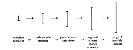
PreviousIt only gets more complicated: climate scientists and policy analysts must deal with a Cascade of uncertainties — uncertainties in emissions, carbon cycle response, climate response, and impacts — in order to arrive at a subjective probabilistic estimate for use by policymakers in the assessment of of what is "dangerous" climate change. That is, we must estimate probabilities for future populations, future levels of economic development, and potential technological props accompanying that economic development, which influence the emissions, and thus the radiative forcing, caused by greenhouse gases and other radiatively active constituents. At the same time, we also must deal with the uncertainties inherent in carbon cycle modeling and climate sensitivity estimates. The multitude of factors involved and the great degree of uncertainty related to many of them essentially guarantees that different climate analyses will arrive at very different estimates of the probability of dangerous climate change in 2100. Schneider (2001) showed that much of the confusion in climate change estimates is due to the lack of specification of the probabilities of various scenarios and climate model sensitivities, as well as a lack of discussion on how independent each scenario is from the others, as explained below. (Also see Schneider (2002a) for more details.) Figure — Cascade of uncertainties typical in impact assessments. (Source: modified after Jones, 2000, and the “cascading pyramid of uncertainties” in Schneider, 1983; see Schneider and Kuntz-Duriseti, 2002, Figure 2.3).
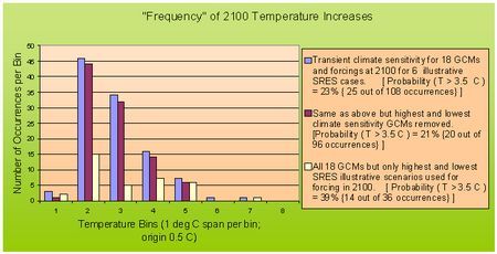
The Range of major uncertainties above shows the “uncertainty explosion” that manifests itself as different elements of uncertainty relating to different parts of climate systems analysis are joined together. In a more complete reproduction than is suggested above, arrows would cycle back from the last entry (impacts range) to the first uncertainty bar (emissions scenarios) since there would be feedback of information from the projected or experienced impacts that might modify human behavior (i.e., policies), which could thus alter emissions scenarios, causing reduced explosion in uncertainty. A model of this type with so many small, yet impactful, nuances would be difficult for a policymaker to create and analyze. For this reason, governments have created scientific assessment groups like the IPCC to evaluate such models and to assess potential future risks so that policies that feed back on the scenarios in a way that might reduce the risks over time can be formulated. The IPCC Working Group I (IPCC 2001a) lead authors used the broad range of emissions scenarios – six representative “storylines” offered by SRES (which Working Group 1 labeled as "equally sound") to produce radiative forcings, which in turn produce a wide range of temperature projections. They did this via the use of seven general circulation models (GCMs), which themselves represented a range of equilibrium climate sensitivities from 1.7 to 4.2 oC warming for a doubling of CO2. (These seven are a subset of eighteen GCMs listed in Table 9.1 of the WG 1 Third Assessment Report, which have an even larger range of climate sensitivities to radiative forcing.) The result of combining (via simpler models) the seven GCMs, each possessing a different climate sensitivity, with the six illustrative scenarios from SRES is WG1's revised temperature projection, which appeared in the TAR, of 1. 4- 5.8 oC further warming by 2100 (see Earth's surface temperature), a big jump from the 1- 3.5 oC range of warming by 2100 offered by the Second Assessment Report in 1996 (see Key Findings of the IPCC SAR, from "Our Changing Planet", NTSC - CENR). This increase (from a top warming of 3.5 to a high of 5.8 oC) would imply a major increase in risks, and this did not go unnoticed by many policymakers! While these new temperature projections represent a significant step, without probabilities for each SRES scenario (and for each GCM climate sensitivity), any policy analyst (or maker) must guess about what the SRES team thought the probabilities were for each storyline or what the WG1 authors thought the likelihoods were for the sensitivities of each of the seven GCMs selected. When all the IPCC's temperature projections, as shown in Earth's surface temperature, are given equal likelihood, then by combining the 6 scenarios and seven GCM sensitivities, the resultant probability distribution for global surface warming in 2100 does not resemble the separate uniform probability distributions (of the scenarios and sensitivities). Rather, the combined probability distribution would have a peak at the center just like a typical bell curve (Jones, 2000). If each storyline is equally likely and each is independent from the others, then combining them into an upside down bell curve of probability like that of the blue bars on the figure temperature increases around 2100 makes sense. But with no assessment of probability or independence, then it is plausible to leave out some of the middle values. Thus, if only the "outlier" (maximum and minimum) scenarios are used, then the probability distribution for 2100 warming would be much flatter (see the white bars on temperature increases around 2100, below, modified after Schneider, 2001). Figure — Frequency of temperature increases around 2100 (source: Schneider, 2002a).
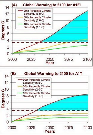
The figure above contains histograms of the number of occurrences of temperature increases around 2100 in seven bins. The starting point is 0.5 oC and each bin is 1 oC wide, so the bin labeled 3, for example, represents the number of occurrences of temperature increases of between 2.5 and 3.5 oC by 2100 for each of the three cases. The blue bars represent the distribution that results from using (a) all 18 GCM transient climate sensitivities (from Table 9.1 of IPCC 2001a), and (b) all 6 forcings (in W/m2) at the year 2100, as detailed in the SRES (from Figure 19 of the Technical Summary of IPCC 2001a). [To use the transient climate sensitivities for forcings equivalent to a doubling of CO2, each of the 6 forcings are divided by 4 W/m2 – an typical estimate for forcing when CO2 doubles.] Out of the 108 outcomes possible when combining all 18 GCM sensitivities with all 6 SRES illustrative scenario forcings, 25 of them occur in bins representing 2100 temperature increases above the threshold value of 3.5 oC – an illustrative threshold value chosen arbitrarily by me in Schneider 2001, but one which would be suggested by many to have the potential to cause significant and perhaps “dangerous” climate damage (IPCC 2001b; Mastrandrea and Schneider 2004). The histogram formed by the red bars represents a trimmed case in which the highest and lowest climate sensitivities are removed from the analysis. In this case, only 21% (20 out of 96) of the occurrences exceed the threshold warming of 3.5 oC. Finally, the white bar histogram represents a case in which all 18 GCM sensitivities are used, but only two SRES forcings (the highest, A1FI; and the lowest, B1 -- see also Hayhoe et al. 2004) are used. In this situation, the threshold value of 3.5 oC warming in 2100 is exceeded 14 out of 36 times, meaning there is a much larger likelihood (39%) of “dangerous” climatic damage in this case than for either of the other two. (3.5 oC is a conservative estimate for triggering 'dangerous' impacts, as the European Union, for example, has said it believes that threshold is at 2 oC.) In the temperature increases around 2100 figure, the blue bars show that when all eighteen GCMs (Table 9.1 of Working Group I) and all six illustrative SRES scenarios are used, a more peaked curve is indeed obtained. Even in this case, 23% of the values obtained for temperature increase in 2100 are still greater than 3.5 oC. The red bars show that almost the same results are obtained for the case in which the highest and lowest GCM climate sensitivities are removed from the data set, explaining why there are no red bars are seen in temperature increases around 2100 for very large warming. However, 21% of the values obtained still exceed the 3.5 oC threshold. Finally, the yellow bars in temperature increases around 2100 show the very much flattened distribution obtained by using all 18 GCM sensitivities but omitting all the scenarios except the most and least drastic (that is, keeping only A1FI and B1). While this approach may seem arbitrary, it follows the logic of the SRES authors, who stated that: “the writing team as a whole has no preference for any of the scenarios." Given the relative lack of “middle value” scenarios, the shape of the probability distribution is much flatter. More importantly, nearly twice as large a percentage of values (39%) are for 2100 temperature increases greater than 3.5 oC (39%). Clearly, a policymaker wanting to “avoid dangerous anthropogenic interference with the climate system,” as the UNFCCC phrased it, would be much more inclined to propose stronger policies and measures for a 39% likelihood of crossing some“dangerous” threshold than for a 21% probability. Consider another simpler way to approach this question of the joint probability of temperature rise to 2100 and crossing “dangerous” warming thresholds. Instead of using two probability distributions, an analyst could pick a high, medium, and low value for each factor and plot the results in a single line. For example, a glance at Andronova and Schlesinger's, 2001 cumulative probability density function — Single probability density function — shows that the tenth percentile value for climate sensitivity is 1.1 oC for a doubling of CO2 (i.e., 4 W/m2) of radiative forcing. 1.1 oC is, of course, below the IPCC's lower limit climate sensitivity value of 1.5 oC. However, on the Single probability density function, this merely means that there is a ten percent chance climate sensitivity will be 1.1 oC or less — that is, a 90% chance climate sensitivity will be 1.1 oC or higher. The 50th percentile result — that is, the value at which climate sensitivity is as likely to be above as below — is 2.0 oC. The 90th percentile value for climate sensitivity on the Single probability density function is 6.8 oC, meaning there is a 90% chance climate sensitivity is 6.8 oC or less, but there is still a very uncomfortable 10% chance it is even higher than 6.8 oC — a value well above the 4.5 oC figure that marks the top of the IPCC's range. Using these three values to represent a high, medium, and low climate sensitivity can produce three alternate projections of temperature over time, once an emission scenario is decided on. In my recent research, I have combined the three climate sensitivities just explained with two SRES storylines (see the Emission scenarios or the A1F1, A1T and A1B Emission Scenarios), the very high emissions, fossil fuel-intensive scenario, A1FI; and A1T, the high technological innovation scenario, in which development and deployment of advanced technologies dramatically reduces the long term (i.e., after 2050) emissions. This comparison pair almost brackets the high and low ends of the six SRES representative scenarios’ range of cumulative emissions to 2100, and since both are for the A1 world, the only major difference between them is the technology component — a “policy lever” that could be activated through the implementation of policies to encourage decarbonization. Therefore, asking how different the evolution of projected climate is to 2100 for the two different scenarios is a very instructive exercise and can help in exploring in a partial way the different likelihoods of crossing “dangerous” warming thresholds. (In the context of California, this is done by Hayhoe et al. 2004, using two GCMs with different climate sensitivities and for the A1FI and B1 scenarios.) I’ll stick with my conservative estimate of 3.5 oC for this threshold to be consistent with temperature increases around 2100 and much of the published impacts literature as summarized by the IPCC Working Group II TAR. Figure — Three climate sensitivities and two scenarios.
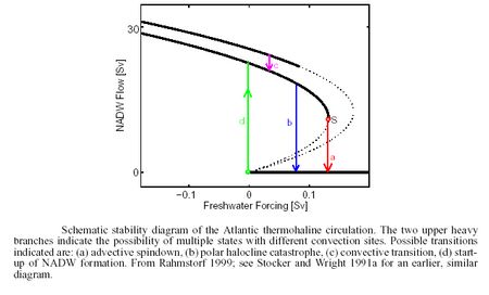
As noted in the Figure above, the three climate sensitivities — 10th, 50th and 90th percentiles — designated by Andronova and Schlesinger (Single probability density function) are combined with the radiative forcings for the A1FI and A1T scenarios. The dashed horizontal lines in both graphs represent the 3.5 oC threshold, and the blue shaded area marks the extent to which the two scenarios exceed that 3.5 oC threshold. These produce similar projections of warming for the first several decades of the 21st century, but diverge considerably— especially the high-sensitivity 90th percentile case — after mid-century. The 50th and 90th percentile A1FI cases both exceed a threshold of 3.5 oC warming before 2100, and the area shaded in blue is much more dramatic in the fossil intensive scenario than the technological innovation scenario. In fact, at 2100, when the A1T curves are flattening out, the A1FI temperatures are still upwardly sloped — implying yet greater warming in the 22nd century. Thus, in order to fully assess “dangerous” climate change potential, simulations that cover well over 100 years are necessary since it is widely considered that warming above a few degrees Celsius is likely to be much more harmful than for changes below a few degrees (see IPCC Working Group II, TAR, Chapter 1 and Chapter 19; and Climate Change Impacts). The most striking feature of both scenarios in Three climate sensitivities is the top (red) line, which rises very steeply above the other two lines below. That is because of the peculiar shape of the probability density function for climate sensitivity in the Single probability density function— it has a long tail to the right due to the possibility that reflective aerosols have been holding back not-yet-realized warming. Also striking is that both the results for both the A1FI and A1T scenarios don’t differ much in 2050, but then diverge considerably by 2100. This has led some to declare (erroneously, in my view) that there is very little difference in climate change across scenarios or even among different climate models with different sensitivities. This is clearly wrong, for although both A1FI and A1T have emissions, and thus CO2 concentration projections, that are not very different for the first several decades of the 21st century, they diverge after 2050, as does the temperature response. For the 90th percentile results, both the A1FI and the A1T temperature projections exceed the “dangerous” threshold of 3.5 oC at roughly the same time (around 2040), but the A1FI warming not only goes on to outstrip the A1T warming, but is still steeply sloped at 2100, implying warming beyond 13 oC in the 22nd century, which would undoubtedly leave a dramatic legacy of stressful environmental change for distant posterity. This simple pair of figures (Three climate sensitivities, A and B) shows via a small number of curves (six in all) a range of temperature changes over time for three climate sensitivity percentiles, but does not give probabilities for emissions scenarios themselves; only two are used to “bracket uncertainty,” and thus no joint probability can be gleaned from this exercise. This is the next step that needs to be taken by IPCC analysts. An MIT integrated assessment group has already attempted it using a series of different models and expert judgments to fashion a probability distribution for future climatic changes (Webster et al., 2003). Another approach is based on published probabilities for climate sensitivity, and an estimate of the likelihood a given warming might be considered "dangerous" (Mastandrea and Schneider, 2004). These kinds of approaches, I predict, will be the wave of the future in such analyses, but given the heavy model-dependence of any such results, individual “answers” will remain controversial and assumption-bound for a considerable time to come. The likelihood of threshold-crossing is thus quite sensitive to the particular selection of scenarios and climate sensitivities used. This suggests there is some urgency to assessing the relative likelihood of each such entry (scenario and sensitivity) so that the joint distribution (represented on the histogram of temperature increases around 2100) has a meaning that is consistent with the underlying probabilistic assessment of its components. Arbitrary selection of scenarios or sensitivities will produce distributions that could easily be misinterpreted by integrated assessors or policymakers if they are not assigned reasonable subjective probabilities. For this reason, the word “frequency” appears in quotation marks in temperature increases around 2100 since it does not represent an intellectually or analytically justifiable probability distribution, given that the subcomponents were arbitrarily chosen; there was no “traceable account” (e.g., Moss and Schneider, 2000) of why the particular selections were made. Three climate sensitivities, while not a full joint probability distribution, at least has the virtue of transparent assumptions. If conventional economic discounting were applied, some present-day “rationalists” might argue that the present value of damages postponed for centuries is virtually nil. But what if our behavior were to trigger irreversible changes in sea levels and ocean currents, or the extinction of species (on civilization time scales)? Is it fair to future generations for us to leave them the simultaneous legacy of more wealth and severe ecosystem damage? Especially when neither the wealth nor the ecosystem damages will be equitably distributed? This is the policy dilemma thoughtful analysts of the climate policy debate have to ponder, since the next few generations’ behaviors will precondition to a considerable extent the long-term evolution of the climate and its attendant impacts for a hundred generations. Climate Surprises and a Wavering Gulf Stream?Another concern for the 22nd century is the possibility of climate change causing abrupt nonlinear events — often dubbed “climate surprises.” Several have already been mentioned — like deglaciation and alteration of oceanic currents. The prime example of the latter is the northward extension of the Gulf Stream to far Northern Europe and its moderating influence on climate there. The possibility of abrupt climate change did not become a mainstream belief until very recently. While Bryson, Schneider, and a few other began worrying about "climate surprises" in the 1970s, it wasn't until 1993 that the concept became widespread. In that year, a team of Americans and Europeans collected ice cores from two locations about 30 kilometers apart (so that they could confirm that they were detecting large-scale trends rather than local anomalies) in Greenland. The comparison of cores indicated that climate change was indeed occurring, and at a pace, for a score of occasions, that was ever more rapid than previously imagined: Swings of temperatures that were believed in the 1950s to take tens of thousands of years, in the 1970s to take thousands of years, and in the 1980s to take hundreds of years, were now found to take only decades. Greenland had sometimes warmed a shocking 7oC within a span of less than 50 years. More recent studies have reported that, during the Younger Dryas transition, drastic shifts in the entire North Atlantic climate could be seen within five snow layers, that is, as little as five years! (From Spencer Weart's discussion of the history of abrupt climate change.) Thereafter, many other indicators of possible rapid climate change were unearthed, and scientific thinking on climate change experienced a radical phase shift, moving from thinking of global warming on a millennial time scale to assessing it on a decadal time scale. Acknowledgments of abrupt events is extremely important, as it is they (rather than gradual climate change-induced events) that will likely cause the most damage to natural and human systems alike, since adaptation of humans or nature to slow change is much easier than to rapid change in climate. So, who is really surprised? In climatology, events that are improbable or simply not well understood— but that are not truly unknown — are better defined as imaginable abrupt events, than real surprises. Although the likelihood of these events may be unknown, it is still possible to imagine them. There are also potential outcomes we can't now imagine — true surprises — but of which we do know what might bring them on. Thus, it is possible to identify imaginable conditions for surprise. The rate of change of CO2 concentrations is one imaginable condition for surprise, since rapid forcing could create non-linear responses. However, the system would be less “rapidly forced” if decision-makers enacted policies to slow down the rate at which human activities modify the atmosphere. To deal with such questions, the policy community needs to understand both the potential for surprises and how difficult it is for integrated assessment models (IAMs) to credibly evaluate the probabilities of currently imaginable “surprises,” let alone those not currently envisioned (Schneider, Turner and Morehouse Garriga, 1998). Even without surprises, most global systems are inherently complex, consisting of multiple interacting sub-units. Scientists frequently attempt to model these complex systems in isolation, where they produce internally stable and predictable behavior. However, real-world coupling between subsystems often causes those systems to exhibit new collective behaviors — called “emergent properties” — that are not demonstrable by models that do not include such coupling. These may include the types of "surprises" mentioned above. Furthermore, responses of coupled systems to external forcing can be quite complicated (see, e.g., the NAS report on Abrupt Climate Change: Inevitable Surprises, "Processes that Cause Abrupt Climate Change", and related materials). One emergent property of the effects of change on coupled systems that is becoming increasingly evident in climate and biological systems is that of irreversibility or hysteresis: changes persist in the new post-disturbance state even when the original forcing is restored. This irreversibility can be a consequence of multiple stable equilibria in the coupled system — that is, the same forcing might produce different responses depending on the pathway followed by the system. Therefore, anomalies can push the coupled system from one equilibrium to another, each of which may have a very different sensitivity to disturbances (i.e., each equilibrium may be self-sustaining). This goes against the common view that the climate system and ecosystem structure and function exhibit path-independence, or “ergodicity,” and it holds implications for effective policymaking. Incorporating possibly damaging effects of path-dependent changes on various systems into climate change policy can significantly alter policy recommendations and leads to discovery of emergent properties of the coupled social-natural system (see Higgins et al., 2002, from which much of this section is adapted). Exponential increases in computational power have encouraged scientists to turn their attention to projects involving the coupling of multiple disciplinary models. General Circulation Models (GCMs) of the atmosphere and oceans, for example, now allow scientists to explore emergent properties in the climate system resulting from interactions between the atmospheric, oceanic, biospheric, and cryogenic components. This has allowed them to study processes that exhibit complex, nonlinear behavior. Simpler, more computationally affordable models that can be run over very long times show multiple stable equilibrium states of the thermohaline circulation (THC) in the North Atlantic Ocean and of the atmosphere-biosphere interactions in Western Africa. I will discuss THC in detail below. Thermohaline Circulation. THC in the Atlantic brings warm tropical water northward, raising sea surface temperatures (SSTs) about 4 °C relative to SSTs at comparable latitudes in the Pacific. The warm SSTs in the North Atlantic provide heat and moisture to the atmosphere, causing Greenland and Western Europe to be roughly 5-8 °C warmer than they would be otherwise. THC also increases precipitation throughout the region (Stocker and Marchal, 2000 and Broecker, 1997). Temperature and salinity patterns in the Atlantic create the density differences that drive THC. As the warm surface waters move to higher northern latitudes, heat exchange with the atmosphere causes the water to cool and sink at two primary locations: one south of the Greenland-Iceland-Scotland (GIS) Ridge in the Labrador Sea and the other north of the GIS ridge in the Greenland and Norwegian Seas (see Atlantic thermohaline circulation, Rahmstorf, 1999, and Rahmstorf, 2002). Water sinking at the two sites combines to form North Atlantic Deep Water (NADW), which then flows to the southern hemisphere via the deep Western Boundary Current (WBC). From there, NADW mixes with the circumpolar Antarctic current and is distributed to the Pacific and Indian Oceans, where it upwells, warms, and returns to the South Atlantic. As a result, there is a net northward flow of warm, salty water at the surface of the North Atlantic. Paleoclimatic reconstruction and model simulations suggest there are multiple equilibria for THC in the North Atlantic, one being complete collapse of circulation. These multiple equilibria are an emergent property of the coupled ocean-atmosphere system. Switching between the equilibria may occur as a result of temperature or freshwater forcing. Thus, the pattern of THC that exists today could be modified by an infusion of fresh water at higher latitudes or through high-latitude warming and the concomitant reduction in the equator-to-pole temperature gradient. These changes may occur if climate change increases precipitation, causes glaciers to melt, or warms high latitudes more than low latitudes, as is often projected (IPCC, 1996 and 2001a; Chapter 4 of Abrupt Climate Change: Inevitable Surprises (2002)). Preliminary evidence that changes in Atlantic currents are indeed occurring is reported by Curry et al., 2003. Their research has led them to conclude that the salt levels of the Atlantic Ocean have changed so greatly over the last 40 years due to global warming that the whole flow of ocean water has been altered. If the Atlantic's salinity continues to change, Curry et al. believe that Northern Europe could cool significantly. Is something significant starting to build? Perhaps, but it is too soon to have much confidence in current assessments. But what if the worries are right? However, some coupled models of the atmosphere and oceans (e.g., Yin et al., 2004) do not produce a THC collapse from global warming, owing to some still-not-fully-understood feedback processes in them. That is part of the reason it is very difficult to assign any confident probabilities to the possibility of a THC collapse. In spite of the Yin et al. and some other models, they are only that -- models -- and thus it is not possible to rule a THC collapse out with a high level of confidence, either. Though I do not believe that THC collapse could occur as soon as 2010, as suggested in a recent Pentagon report (see Contrarian Science for more details), I believe that there are first-decimal-places odds that it could eventually occur, in a century or so, hence the need for continued investigation and the wish of many climatologists that the subject of THC collapse not be left out of the policy debate. The Pentagon report, referenced above, makes specific mention of the collapse of thermohaline circulation that occurred near the beginning of the Younger Dryas period (which started 12,800 years ago and ended 11,600 years ago -- this collapse is thought to have occurred about 12,700 years ago), which is associate with 27+ degrees Fahrenheit of cooling in Greenland and major change throughout the entire North Atlantic region. The report seems to suggest that the mechanisms driving the Younger Dryas THC collapse would be similar to those that would drive a future THC collapse, but in fact, the driving forces would likely not be the same. During the Younger Dryas, it is believed that THC collapse was caused by a massive melt water flood from the waning ice age, whereas most climatologists studying THC agree that a future collapse would most likely be the transport of fresh water during storms, which could cause the North Atlantic region to reach a critical threshold (see Broecker's (2004) letter to Science). That threshold would be marked by an infusion of fresh water at higher latitudes and/or through warming at higher latitudes (which would reduce the equator-to-pole temperature differential), as discussed above. While a THC collapse could occur ten years after that threshold is crossed, it is highly unlikely that it could occur ten to twenty years from now, as the Pentagon report postulates. The conditions necessary to trigger the Younger Dryas THC collapse have to be reached, and we're not very likely to be near those yet, but neither can we rule out the possibility that we've already started a process that may take a century to play out. In fact, Kerr, 2004 reports that the North Atlantic subpolar gyre has weakened since the 1990s, though it is not known whether the weakening is a random fluctuation from which the system will recover or if it is a warning sign of collapse of THC. Work by Häkkinen and Rhines, 2004 concurs. Further research on THC collapse has focused on coupled climate-economic modeling (Mastrandrea and Schneider, 2001). Again, this coupled multi-system exhibits behavior that is not revealed by single-discipline sub-models alone. As an example, an analyst's choices of model parameter values, such as the discount rate, determines whether emissions mitigation decisions made in the near-term will prevent a future THC collapse or not — clearly a property not obtainable by an economic or climate model per se. Figure — Schematic stability diagram of the Atlantic thermohaline circulation (source: Rahmstorf, 1999).
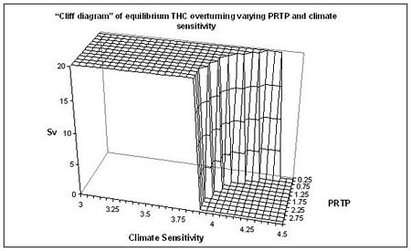
Rahmstorf (1999) presents a schematic stability diagram of THC (the Figure above), which is based on his modification of the conceptual model of salinity feedback originally developed by Henry Stommel. This diagram demonstrates three possible classes of THC equilibrium states (based on different levels of freshwater forcing) and the theoretical mechanisms for switching between them. These include two classes of deepwater formation, one with sinking in the Labrador Sea and North of the GIs ridge and one with sinking North of the GIs ridge alone; and one class of complete shutdown of THC. Key to Rahmstorf's work is the idea that switching between stable equilibria can occur very rapidly under certain conditions. He expands on this in Rahmstorf (2002), in which he says: “The role of the ocean circulation is that of a highly nonlinear amplifier of climatic changes. The paleoclimatic record supports this, suggesting rapid and repeated switching between equilibria, on the order of years to decades (de Menocal and Bond, 1997). Evidence indicates that during glacial periods, partial collapse of the continental ice sheets into the North Atlantic freed large amounts of fresh water through extensive iceberg releases (Seidov and Maslin, 1999) that would today be sufficient to cause a change in THC's equilibrium state. Complex general circulation models (GCMs) suggest that future climate change could cause a similar slowdown (a collapse is less certain) in THC overturning (Wood et al., 1999, Manabe and Stouffer, 1993). The Simple Climate Demonstrator (SCD) developed by Schneider and Thompson (2000), uses a straightforward, density-driven set of Atlantic ocean "boxes" that mimic the results of complex models. The SCD's sufficient computational efficiency allows it to facilitate sensitivity analysis of key parameters and generate a domain of scenarios that show abrupt collapse of THC. Model results (e.g., Stocker and Marchal, 2000; Schneider and Thompson, 2000) suggest that both the amount of greenhouse gases entering the atmosphere and the rate of buildup will affect the THC overturning. If warming reduces the ability of surface water to sink at high latitudes, this will interfere with the inflow of warm water from the south. Such a slowdown will cause local cooling, which will most likely re-energize the local sinking and serve as a stabilizing negative feedback on the slowdown. On the other hand, the initial slowdown of the strength of the Gulf Stream will reduce the flow of salty subtropical water to the higher latitudes of the North Atlantic. This would act as a destabilizing positive feedback on the process by further decreasing the salinity of the North Atlantic surface water and reducing its density, further inhibiting local sinking. The rate at which the warming forcing is applied to the coupled system could determine which of these opposing feedbacks dominates and whether a THC collapse occurs. Nordhaus (1992) first attempted to couple a simple climate model (Schneider and Thompson, 1981) with a simple energy-economy model in 1992, when he introduced his Dynamic Integrated Climate Economy (DICE) model, a simple optimal growth model. The model does not consider abrupt events or surprises, but generates an optimal future forecast for a number of economic and environmental variables using a set of explicit value judgments and assumptions. It does this by maximizing discounted utility (satisfaction from consumption) by balancing the costs to the economy of greenhouse gas emissions abatement (a loss in a portion of GDP caused by higher carbon energy prices) against the costs of the buildup of atmospheric GHG concentrations. This buildup affects the climate, which in turn causes “climate damage,” indicated by a reduction in gross domestic product (GDP) determined by the rise in globally averaged surface temperature due to GHG emissions. The model aggregates across all sectors and regions and thus assumes that the aggregate measure of damage is always a positive cost. Mastrandrea and Schneider (2001) have developed a modified version of Nordhaus’ DICE model called E-DICE, containing an enhanced damage function that reflects the higher likely damages that would result when abrupt climate changes occur. If climate changes are smooth and thus relatively predictable, then the foresight afforded increases the capacity of society to adapt, hence damages will be lower than for very rapid and less-anticipated changes — “surprises” such as a THC slowdown or collapse. To test both the DICE and E-DICE models, we must go back to the SCD model, where a THC collapse can be synthesized for rapid and large CO2 increases. An “optimal” solution of conventional DICE can produce an emissions profile that triggers such a collapse, as it lacks internal abrupt nonlinear dynamics and the enhanced damages that would likely occur if THC collapsed. However, this abrupt nonlinear event can be prevented when the damage function in DICE is modified to account for enhanced damages created by this THC collapse and THC behavior is incorporated into the coupled climate-economy model. The results reveal an emergent property of the coupled climate-economy system that is not shown by separate single models of nature or society alone. (Since the processes that the models either treat simply or ignore by their high degree of aggregation require heroic parameterizations, the quantitative results are only used as a tool for insights into potential qualitative behaviors. The numbers we present, therefore, are not intended to be taken literally.) The amount of near-term mitigation the DICE model “recommends” to reduce future damages is critically dependent on the discount rate (see the Cliff diagram, from Mastrandrea and Schneider, 2001). The "Cliff diagram” below shows the equilibrium THC overturning for different combinations of climate sensitivity and a factor related to the discount rate, the pure rate of time preference (PRTP). Time preference expresses an individual's or group's preference on the timing of costs and benefits of an action (or lack thereof). In general, there is a premium placed on present versus future benefits; people typically choose to reap benefits sooner and incur costs later. The PRTP is a measure of the strength of this preference and is proportional to the discount rate. The higher the PRTP, the more the present is valued over the future (and, in the case of climate change, the less likely we are to spend money to reduce CO2 and other greenhouse gas emissions now, given that the benefits — reduced climate changes — won't be felt until the distant future) and vice versa. The normal THC is a steady circulation with flow rate of about 20 Sverdrups (20 million cubic meters of water flowing per second). The climate sensitivity is the amount of global average surface temperature change that would eventually occur if CO2 were to double and then be held fixed for many centuries (see Climate Science — Projections). The higher the climate sensitivity, the more climate change will occur for any stabilization concentration target. As the PRTP decreases, “normal” circulation (20 Sv) is preserved for disproportionately higher climate sensitivities since the lower PRTP leads to larger emissions reductions in E-DICE, and thus it takes a higher climate sensitivity to reach the “cliff.” Thus, for low discount rates (PRTP of less than 1.8% in one formulation — see Mastrandrea and Schneider, 2001, their Figure 4), the present value of future damages creates a sufficient carbon tax to keep emissions below the trigger level for the abrupt nonlinear collapse of the THC over a century later. That is, the THC continues to churn warm water to Northern Europe at nearly the typical rate of some 20 Sv. But a higher discount rate sufficiently reduces the present value of even potentially catastrophic long-term damages such that an abrupt nonlinear THC collapse — the system “falls off the cliff” and the THC essentially ceases to perform its heat transferring function — becomes an emergent property of the coupled socio-natural system. The discount rate thereby becomes a parameter that has a major influence on the 22nd century behavior of the modeled climate. Figure — “Cliff diagram” of equilibrium Thermohaline Circulation (THC) in the North Atlantic Ocean overturning varying PRTP and climate sensitivity. Two states of the system — “normal” (20 Sv of warm water flow to Northern Europe) and “collapsed” (0 Sv) THC—are seen here. The numbers are only for illustration as several parameters relevant to the conditions in which the THC collapse occurs are not varied across their full range in this calculation, which is primarily shown to illustrate the emergent property of high sensitivity to discounting in a coupled socio-natural model (e.g., from Mastrandrea and Schneider, 2001). 1 Sv is equal to one million cubic meters of water flowing per second and is the measure that is normally used to gauge the intensity of oceanic currents.
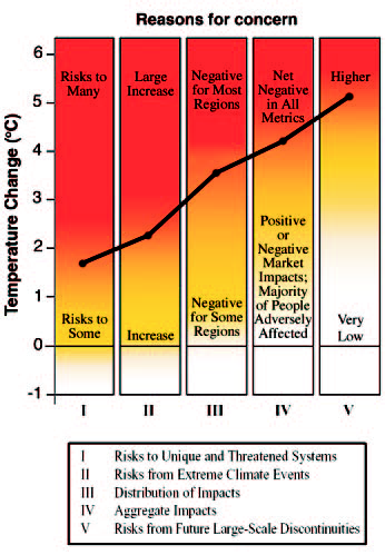
Although these highly aggregated models cannot provide high-confidence quantitative projections of coupled socio-natural system behaviors, they are still more informative and helpful than the bulk of integrated assessment models currently used for climate policy analysis, which do not include any such abrupt nonlinear processes and will not be able to alert the policymaking community to the importance of abrupt nonlinear behaviors. At the very least, the ranges of estimates of future climate damages should be expanded to include nonlinear behaviors (e.g., Moss and Schneider, 2000). Defining what is “dangerous” climatic change will be deeply influenced by abrupt nonlinear climatic events — events the IPCC Working Group II considers to be much more likely for warming above a few degrees Celsius. Mastrandrea and Schneider, 2004 also use the original DICE model for a more general purpose: to calculate the probability of "dangerous anthropogenic interference" (DAI), a term originally used in the UN's 1992 Framework Convention on Climate Change, and the benefits of climate policies in terms of preventing DAI. They begin by suggesting that DAI should be defined in terms of the consequences (impacts) of climate change. They have modified the IPCC's "burning embers" diagram to include a cumulative density function (CDF) -- the thin black line in the figure below -- by assigning data points at each transition-to-red threshold on the diagram and assuming that the probability of "dangerous" change increases cumulatively at each threshold temperature by a quintile. They use this as a starting point for analyzing "dangerous" climate change.
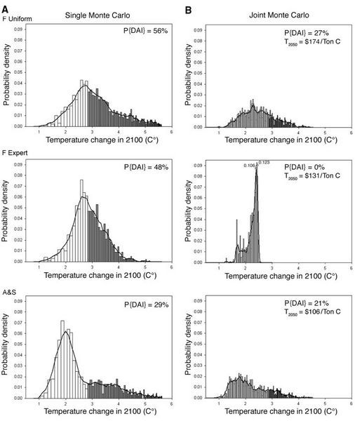
Figure — An adaptation of the IPCC Reasons for Concern figure, with the thresholds used to generate our CDF for "dangerous anthropogenic interference" (DAI). The IPCC figure conceptualizes five reasons for concern, mapped against climate change through 2100. As temperature increases, colors become redder: white indicates neutral or small negative or positive impacts or risks, yellow indicates negative impacts for some systems, and red means negative impacts or risks that are more widespread and/or greater in magnitude. The risks of adverse impacts from climate change increase with the magnitude of change, involving more of the reasons for concern. For simplicity, we use the transition-to-red thresholds for each reason for concern to construct a CDF for DAI, assuming the probability of DAI increases by a quintile as each threshold is reached. (Source: Mastrandrea and Schneider, 2004; adapted from Figure SPM2, IPCC TAR SPM of WG II). To calculate the probability of DAI, Mastrandrea and Schneider find 2.85 ºC as their median threshold for "dangerous" climate change, consistent with IPCC Working Group II's assessment that after "a few degrees," many serious climate change impacts could be anticipated. However, 2.85 ºC may still be conservative, since the IPCC also noted that some "unique and valuable" systems could be lost at warmings any higher than 1-1.5 ºC. Mastrandrea and Schneider use three key parameters - climate sensitivity, climate damages, and the discount rate - all of which carry high degrees of uncertainty yet are crucial factors in determining the policy implications of global climate change. To perform these calculations, they use Nordhaus' (1992) DICE model, discussed above (in the section on THC), because it is a relatively simple and transparent IAM, despite its well-known limitations. Using an IAM allows for exploration of the impacts of a wide range of mitigation levels on the potential for exceeding a policy-important temperature-warming threshold such as DAI. When looking at all three parameters, Mastrandrea and Schneider focus on two types of model output: global average surface temperature change in 2100, which is used to evaluate the potential for DAI; and "optimal" carbon taxes. They begin with climate sensitivity, typically defined as the amount that global average temperature is expected to rise for a doubling of CO2 from pre-industrial levels. The IPCC estimates that climate sensitivity ranges between 1.5 ºC and 4.5 ºC, but it has not assigned subjective probabilities to the values within this range, making risk analysis difficult. However, recent studies, many of which produce climate sensitivity distributions wider than the IPCC's 1.5 ºC to 4.5 ºC range, with significant probability of climate sensitivity above 4.5 ºC, are now available. Mastrandrea and Schneider use three such probability distributions: the combined distribution from Andronova and Schlesinger (2001), and the expert prior (F Exp) and uniform prior (F Uni) distributions from Forest et al. (2001). They perform a Monte Carlo analysis sampling from each climate sensitivity probability distribution separately, without applying any mitigation policy, so that all variation in results will be solely from variation in climate sensitivity. The probability distributions they produce (see (a) in Mastrandrea and Schneider's probability distribution figure, below) show the percentage of outcomes resulting in temperature increases above their 50th percentile 2.85 ºC "dangerous" threshold. As shown in the graph, the probability of exceeding DAI at 2.85 ºC ranges from 29% to 56%, depending on the climate sensitivity distribution used. Mastrandrea and Schneider's next simulation is a joint Monte Carlo analysis looking at temperature increase in 2100 from varying both climate sensitivity and the climate damage function (see (b) in Mastrandrea and Schneider's probability distribution figure, below), their second parameter. For the damage function, they sample from the distributions of Roughgarden and Schneider (1999), which produce a range of climate damage functions both stronger and weaker than the original DICE function. As shown, the joint runs show lower chances of dangerous climate change as a result of the more stringent climate policy controls generated by the model due to the inclusion of climate damages. Time-varying median carbon taxes are over $50/Ton C by 2010, and over $100/Ton C by 2050 in each joint analysis. Lower temperature increases and reduced probability of "DAI" are calculated if carbon taxes are high, but because this analysis only considers one possible threshold for "DAI" (the median threshold) and assumes a relatively low discount rate (about 1%), these results do not fully describe the relationships between climate policy controls and the potential for "dangerous" climate change.
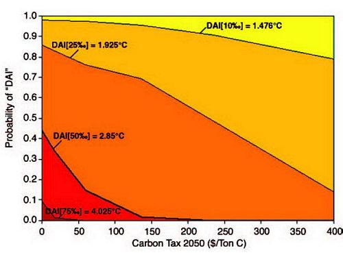
Figure — Probability distributions . (A) Probability distributions for each climate sensitivity distribution for the climate sensitivity – only Monte Carlo analyses with zero damages and 0% PRTP (a 1% discount rate). (B) Probability distributions for the joint (climate sensitivity and climate damage) MC analyses. All distributions display a 3-bin running mean and the percentage of outcomes above our median threshold of 2.85°C for dangerous climate change, P{DAI[50‰]}. The joint distributions display carbon taxes calculated in 2050 (T2050) by the DICE model, using the median climate sensitivity from each climate sensitivity distribution and the median climate damage function for the joint Monte Carlo cases. When we compare the joint cases with climate policy controls (B) to the climate sensitivity – only cases without climate policy controls (A) – sufficient carbon taxes reduce the potential (significantly in two out of three cases) for DAI[50‰]. (Source: Mastrandrea and Schneider, 2004.) Mastrandrea and Schneider attempt to characterize the relationship between climate policy controls and the potential for "dangerous" climate change by calculating a series of single Monte Carlo analyses, varying climate sensitivity, for a range of fixed damage functions. For each damage function, ranging from the 10th through 90th percentile of the climate damage probability distribution, they perform a Monte Carlo analysis sampling from each climate sensitivity distribution. They also calculate the carbon tax specified in 2050 for model runs using the median climate sensitivity of each probability distribution and the median damage function. Averaging the results from each set of three Monte Carlo analyses gives the probability of DAI at a given 2050 carbon tax under the assumptions described above, as shown in Mastrandrea and Schneider's figure relating carbon taxes and DAI, below. Each band in the figure corresponds to a different percentile range for the "dangerous" threshold CDF-a lower percentile from the CDF representing a lower temperature threshold for DAI. At any DAI threshold, climate policy "works:" higher carbon taxes lower the probability of considerable future temperature increase, and reduce the probability of DAI. If we inspect the median (DAI[50%]) threshold for DAI (the thicker black line in Mastrandrea and Schneider's figure on optimal carbon tax, below), we see that a carbon tax by 2050 of $150-$200/Ton C will reduce the probability of "DAI" to nearly zero, from 45% without climate policy controls (for a 0% PRTP, equivalent to about a 1% discount rate).
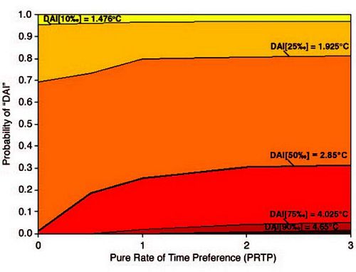
Figure — The modeled relationship between the PRTP — a factor determining the discount rate — and the probability of DAI in 2100. Increasing the PRTP (and therefore the discount rate) reduces the present value of future climate damages and increases the probability of DAI[X‰] as indicated, where X is the percentile from the DAI CDF derivable from the adaptation of the IPCC Reasons for Concern figure. The solid lines indicate the percentage of outcomes above the stated threshold for DAI[X‰] for any given level of PRTP or DAI percentile threshold X. At our median threshold DAI[50‰] (thicker black line), the probability of DAI[50‰] rises from near zero with a 0% PRTP to 30% with a 3% PRTP, as originally specified in the DICE model. (Source: Mastrandrea and Schneider, 2004.) Lastly, Mastrandrea and Schneider run Monte Carlo analyses varying climate sensitivity at different values for the PRTP, which illustrates the relationship between the discount rate and the probability of DAI at different temperature threshold values, as shown in Mastrandrea and Schneider's figure relating PRTP to DAI, below. As expected, increasing the discount rate shifts higher the probability distribution of future temperature increase-a lower level of climate policy controls becomes "optimal" and thus increases the probability of DAI. At our median threshold of 2.85ºC for DAI (the thicker black line Mastrandrea and Schneider's figure on discounting, below), the probability of DAI rises from near zero with a 0% PRTP to 30% with a 3% PRTP. A PRTP of 3% is the value originally specified in Nordhaus' DICE model. It is also clear that at PRTP values greater than 1%, the "optimal" outcome becomes increasingly insensitive to variation in future climate damages driven by variation in climate sensitivity.
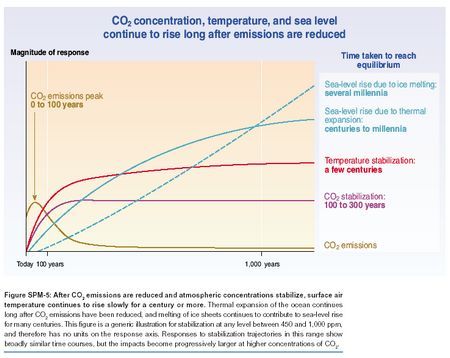
Figure — The modeled relationship between carbon taxes in 2050 (a proxy for general climate policy controls) and the probability of DAI in 2100. Each color band represents a different percentile range from the DAI threshold CDF—a lower percentile from the CDF representing a lower temperature threshold for DAI, as indicated. The solid lines indicate the percentage of outcomes exceeding the stated threshold for DAI[X‰], where X is the percentile from the DAI CDF derivable from the adaptation of the IPCC Reasons for Concern figure, for any given level of climate policy controls. At any DAI[X‰] threshold, climate policy controls significantly reduce the probability of DAI, and at the median DAI[50‰] threshold (thicker black line), a 2050 carbon tax of $150/ton of C is the model-dependent result necessary to reduce the probability of DAI from 45% to near zero. [With a 3% PRTP, this carbon tax is an order of magnitude less and the reduction in DAI is on the order of 10%]. (Source: Mastrandrea and Schneider, 2004.) While Mastrandrea and Schneider's results using the DICE model do not provide us with quantitative answers, they still demonstrate three very important issues: (1) that DAI can vary significantly depending on its definition, (2) that parameter uncertainty will be critical for all future climate projections, and most importantly for this discussion, (3) that climate policy controls (i.e., carbon taxes) can significantly reduce the probability of dangerous anthropogenic interference. This last finding has considerable implications for introducing climate information to policymakers, as discussed in Climate Policy. Presenting climate modeling results and arguing for the benefits of climate policy should be framed for decision-makers in terms of the potential for climate policy to reduce the likelihood of exceeding a DAI threshold. Policymakers should also be concerned with climate change's ability to cause irreversibility over long time horizons. Consider a specific example: CO2 concentration, temperature and sea level (IPCC Synthesis Report, figure 5-2) shows a “cartoon” of effects that can play themselves out over a millennium, even for decisions taken within the next century. The brown curve on CO2 concentration, temperature and sea level represents fossil fuel era emissions — about a century or two of dumping CO2 and other greenhouse gases into the atmosphere. Depending upon the cumulative emissions (the area under the brown curve), the total increase in CO2 concentrations — the purple curve — will be determined. Note that it takes a few centuries to reach the eventual stabilization level, and, according to this IPCC assessment, it remains for centuries at that level. Even if humanity completely abandons fossil fuel emissions in the 22nd century, essentially irreversible long-term concentration increases in CO2 are projected to remain for a millennium or more (a controversial result, as some models relax the CO2 back again over centuries). Thus, the surface climate will continue to warm from this greenhouse gas elevation, as the red curve suggests, with a transient response of centuries before an equilibrium warmer climate is established. How large that equilibrium temperature increase is depends on the final stabilization level of the CO2, the climate sensitivity (see Three climate sensitivities and Single probability density function), and the degree to which CO2 concentrations relax back to lower levels over centuries. CO2 concentration, temperature and sea level represents 1,000 years of "mixing" in the oceans, in which the global warming at the surface of the oceans is mixed into every cubic meter of ocean water, causing each volumetric unit to expand. Thermal expansion of the oceans would continue until the oceans were well-mixed — a time known to be on the order of 1,000 years, as represented by the solid blue curve on the figure. Thus, even if humans invented cost-effective, zero carbon emitting devices in “only” a century, the consequences of the cumulative emissions during the century or two of the fossil fuel era (the area under the brown curve) could cause essentially irreversible consequences over a millennium or more. Some skeptics have doubted this phenomenon of sea level rise. At a May 3, 2004 briefing on Capitol Hill hosted by the Cooler Heads Coalition (a group very skeptical about whether global warming is actually occurring) and titled "The Impacts of Global Warming: Why the Alarmist View is Wrong," Dr. Nils-Axel Mörner, Professor of paleogeophysics and geodynamics at Stockholm University in Sweden (and one of the presenters) elaborated on his contrarian stance. Mörner believes that global sea level rise cannot be proven: "What happens to temperature is one thing. What happens to the sea is another thing. The two are not connected in the way the IPCC report claims." Mörner cites two pieces of evidence on which he bases his conclusion. First, he says satellite measures show no change in sea level over the past decade, but as noted in Contrarian Science, satellite data is highly controversial and is currently being hotly debated (and new studies are finding increasing evidence showing that satellite data does show significant global warming if read carefully) and surface-level measurements tend to be more reliable. Dr. Mörner's second piece of evidence comes from a study he performed in November 2003 in the Maldive Islands, which was commissioned by the International Union for Quaternary Research's Commission on Sea Level Change and Coastal Evolution (Mörner used to be president of this commission) and published in Global and Planetary Change (see Mörner et al., 2004). Mörner and his colleagues claim that in the Maldives, sea level has fallen by at least 4 centimeters in the last 20 to 30 years and has barely changed at all in the last 100 years. Mörner has said that he believes any "rise" in sea level that is detected is actually just a shifting of water from one area of the globe to another. When presented with this "information," my response was that it is indeed true that locally, many factors influence trends of all kinds, including sea level rises. The point is not to allow a few exceptions to override the most general rule. Thermal expansion of the oceans is real -- physics rules of that type cannot be wrong, but other factors can add to or reverse the trends locally. So, if geological or oceanographic dynamical changes have cause specific spots to pop out of the sea, whatever happened includes the roughly 10-20 centimeters of thermal expansion. For instance, If the sea floor were to drop 30 centimeters due to local tectonic factors, the local sea level would only drop by about 10 centimeters (assuming a 20-centimeter rise due to thermal expansion). The global factor (sea level) rides on top of the local factor (change in sea floor). It is as ridiculous to claim there is no global thermal expansion and sea level rise because one can find local exceptions as it is to show that some parts of the globe are actually cooling, and to ignore that the average across all of the global surface is warming. Using isolated exceptions to global averages is either polemics or bad science, and someone should and ask Mörner et al. if they believe it is valid to generalize to the Earth observations they cite in only a selected few places -- deliberately picked to be exceptions, I suspect. It would be like determining the winner of an election by only polling friendly election districts, not the whole collection of polling places. Finally, the dashed blue curve on CO2 concentration, temperature and sea level represents melting polar glaciers in places like Greenland or West Antarctica, a phenomenon for which scientists are already finding evidence. In Greenland, satellite data, aircraft surveying, and ground measurements show that the country's ice sheet is losing mass rapidly (see Schiermeier, 2004a) and is losing 50 cubic kilometers, or about 1/50,000 of its total volume, each year, which is enough to cause 0.13 millimeters of sea level rise annually (see Krabill et al., 2000). This figure could increase substantially -- after all, if all of Greenland's ice were to melt, it would cause the world's oceans to rise by about 7 meters. While Greenland's ice sheet is much smaller than that of Antarctica, Schiermeier reports that scientists believe it is more likely to melt because: (1) The quantity of floating sea ice in northern oceans is decreasing, meaning there is less ice to reflect sunlight and the ocean absorbs more heat, causing additional glacier melting; and (2) Temperatures in Greenland are higher than those of Antarctica, particularly in the summer. Antarctica's melting ice often refreezes before it reaches the ocean, whereas Greenland's melts into the sea. [Nevertheless, scientists have also detected rises in local temperatures around the Antarctic peninsula, which they believe are causing ice sheet melting and could cause the eventual disappearance of the Larsen Ice Shelf, a giant ice shelf about the size of Scotland (see Shepherd et al., 2003). Instead of only up to a meter of sea level rise over the next century or two from thermal expansion — and a meter or two more from thermal expansion over the five or so centuries after that — a large warming (more than a few degrees C — IPCC 2001b) would likely trigger nonlinear events like a deglaciation of major ice sheets near the poles. That would cause many additional meters of rising seas for many millennia, and once started might not be reversible on the time scale of tens of thousands of years (see Gregory et al., 2004). Toniazzo et al., 2004 and Crowley and Baum, 1995 also believe the glacier loss itself could be permanent even if cooler preindustrial climate conditions returned because it appears that the ice sheet creates its own local climate, and, as summarized by Schiermeier, 2004a, "depends on itself to exist." These changes and the global warming that brought them about could make the current interglacial period last for much longer than normal. Whereas the two most recent interglacials before this one spanned about 10,000 years each, Berger and Loutre, 2002 note that many scientists don't expect the current one to end for another 50,000 to 70,000 years. It is thought that there has only been one other such long interglacial in the last 500,000 years. Some might argue that prolonging one interglacial is not a bad outcome, but the "short-term" (in geological time units of thousands of years) price could be irreversible sea level rises of 5-10 meters, and certain doom for low-lying coastal areas and many small islands. Such very long-term potential irreversibilities are precisely the kinds of nonlinear events that would likely qualify as “dangerous anthropogenic interference with the climate system.” Whether a few generations of people demanding higher material standards of living and using the atmosphere as an unpriced sewer to more rapidly achieve such growth–oriented goals is “ethical” is a value-laden debate that will no doubt heat up as greenhouse gas buildups continue. Appropriate discounting, applicability of cost-benefit and other methods (despite the great remaining uncertainties), and references to the “precautionary principle” will undoubtedly mark this debate. My own personal value position, given the vast uncertainties in both the climate science and impacts estimations, is that we should slow down the rate at which we disturb the climate system — that is, reduce the likelihood of "imaginable conditions for surprise". This can both buy time to understand better what may happen — a process that will take many more decades of research, at least — and to develop lower-cost decarbonization options so that the costs of mitigation can be reduced well below those that would occur if there were no policies in place to provide incentives to reduce emissions and invent cleaner alternatives. Abating the pressure on the climate system, developing alternative energy systems, and otherwise reducing our overconsumption (see Arrow et al., 2003) are the only clear “insurance policy” we have against a number of potentially dangerous irreversibilities and abrupt nonlinear events. (Some have argued that there is another option: "geo-engineering — see Chapter 21 of Schneider, Rosencranz, and Niles, 2002 — for a fuller discussion and citations to the literature on this controversial topic.) These concepts will most likely be debated frequently in the next decade or so, as more and more decision-makers learn that what we do in the next few generations may have indelible impacts on the next hundred generations to come. Figure — CO2 concentration, temperature and sea level (source: IPCC Synthesis Report, figure 5-2).
|