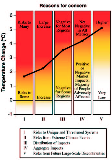
Figure — An adaptation of the IPCC Reasons for Concern figure, with the thresholds used to generate our CDF for "dangerous anthropogenic interference" (DAI). The IPCC figure conceptualizes five reasons for concern, mapped against climate change through 2100. As temperature increases, colors become redder: white indicates neutral or small negative or positive impacts or risks, yellow indicates negative impacts for some systems, and red means negative impacts or risks that are more widespread and/or greater in magnitude. The risks of adverse impacts from climate change increase with the magnitude of change, involving more of the reasons for concern. For simplicity, we use the transition-to-red thresholds for each reason for concern to construct a CDF for DAI, assuming the probability of DAI increases by a quintile as each threshold is reached. (Source: Mastrandrea and Schneider, 2004; adapted from Figure SPM2, IPCC TAR SPM of WG II).